← Back to Projects

BIA Web Redesign

Project Overview

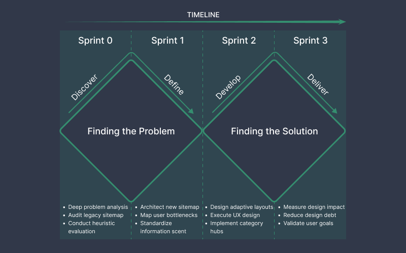
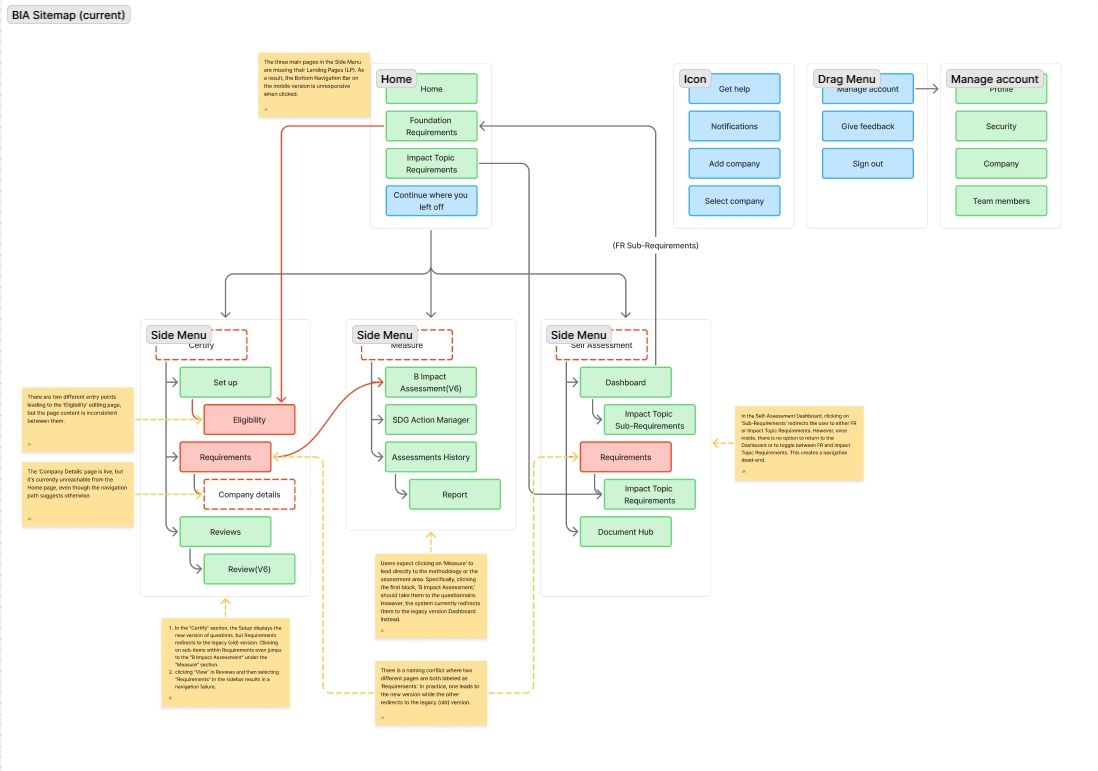
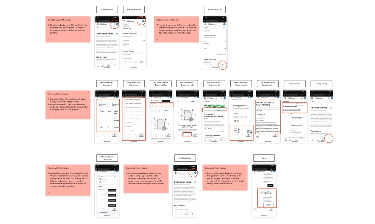
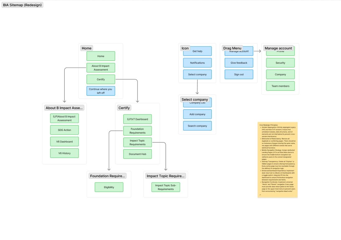
The B Impact Assessment (BIA) is the foundational platform for B Corp Certification. During its transition to new standards, the system faced challenges with excessive navigation depth and poor discoverability, leading to high cognitive load and fragmented workflows. I restructured the Information Architecture (IA) and implemented contextual UI components to transform this complex ecosystem into an intuitive experience, allowing users to focus on sustainability impact rather than system navigation.

My Role: End-to-End Product Design & Strategy

My Role: End-to-End Product Design & Strategy

As the lead and sole designer, I took full ownership of the BIA redesign lifecycle—from discovery to final validation.

Agile Execution: Leveraging my PMP background, I managed the project within a Personal Scrum framework, completing the full redesign across three intensive sprints.

Key Responsibilities: Conducted deep-dive problem analysis, architected a new sitemap, executed the complete UX design phase for high-density data, and established a verification framework to measure effectiveness.

IA Audit: Uncovering Navigational Friction

IA Audit: Uncovering Navigational Friction

Through a comprehensive UX audit of the legacy sitemap, I identified systemic structural flaws that hindered the certification process:

Structural Bottlenecks Identified excessive navigation depth and a fragmented hierarchy that obstructed user progress. Cognitive Load: Discovered \"dead ends,\" ambiguous labeling, and orphan pages that significantly spiked cognitive load. Efficiency Barriers: Found that the separation of functional and instructional content created high interaction friction, directly slowing down BIA certification efficiency.

Heuristic Audit: Identifying Structural & UI Friction

Heuristic Audit: Identifying Structural & UI Friction

Heuristic Evaluation: Identifying UI & Structural Failures I performed a visual audit and heuristic evaluation to pinpoint the technical and usability gaps in the legacy platform:Responsive Issues: Highlighted critical viewport adaptability issues and UI regressions specifically on mobile devices.

User Flow Disruption: Confirmed that these combined factors disrupted the primary user flow and increased cognitive burden.

Strategy Alignment: These findings underscored the necessity for a unified, responsive design system to restore workflow continuity.

Persona 01: The Strategic Decision-Maker

Persona 01: The Strategic Decision-Maker

High-level oversight, bottleneck identification, and seamless task delegation.

Pain Point:Blocked by responsive usability flaws; navigating complex grids on mobile was prone to \"mis-taps\".

Persona 02: The Project Executor

Persona 02: The Project Executor

Goal:Progress visibility and batch efficiency for high-density data entry.

Pain Point:Suffered from \"Navigational Fatigue\" and lost context due to a lack of \"You Are Here\" indicators.

Strategic Solution: IA Overhaul & Cross-Device Continuity

Strategic Solution: IA Overhaul & Cross-Device Continuity

I re-architected the system to bridge the gap between desktop productivity and mobile agility:

Flattening the Hierarchy:Consolidated nested layers to reduce click depth and minimize time-to-task.

Semantic Clarification:Standardized the system’s \"Information Scent\" by eliminating redundant and ambiguous labels.

Adaptive Layouts:

Desktop:Prioritized high-density layouts and robust wayfinding for intensive data management.

Mobile:Introduced \"Category Hubs\" and touch-optimized progress cards for on-the-go tracking and delegation.

Adaptive Cross-Device Continuity: Bridging Complexity and Mobility

To support operational continuity beyond the office, I architected a highly adaptive layout optimized across desktop, laptop, tablet, and mobile viewports:

Strategic Content Prioritization: Rather than mere scaling, the redesign focuses on prioritizing content based on device usage.

Hybrid Layout Approach: Maintained high-density data grids for focused desktop analysis while pivoting to streamlined, touch-optimized cards for mobile.

Contextual Mobility: Empowered stakeholders to oversee milestones and delegate tasks during fragmented windows, such as commutes, maintaining project momentum regardless of physical context.

Desktop: High-Density Productivity

This interface is engineered to support the \"Project Executor\" persona during intensive data management sessions:

Workflow Precision: Prioritizes a high-density information layout and robust wayfinding systems to ensure maximum accuracy.

Efficiency for Power Users: Optimized for long-form BIA assessment tasks, allowing users to navigate impact areas with minimal friction.

Mobile: Strategic On-the-Go Agility

Tailored for the \"Strategic Decision-Maker\" with a fragmented schedule, the mobile version focuses on rapid oversight and action:

Touch-Optimized UI: Features thumb-friendly interactions and simplified Category Hubs to bridge the gap between complex data and mobile management.

Actionable Insights: Transforms complex assessment data into clear progress tracking and task delegation tools, ideal for quick updates during the day.

Impact & Measurable Success

The redesign, driven by PMP-led efficiency, delivered significant improvements:30% Reduction in Click-Depth:Optimized the average path to target pages and accelerated completion velocity.

Enhanced Information Integrity:Eliminated 7 redundant navigational links, effectively reducing user \"looping\" and errors.

50% Mitigation of Design Debt: Resolved critical responsive regressions and established a scalable component framework for future development.

BIA Web Redesign | Kuang Chen | Kuang Chen